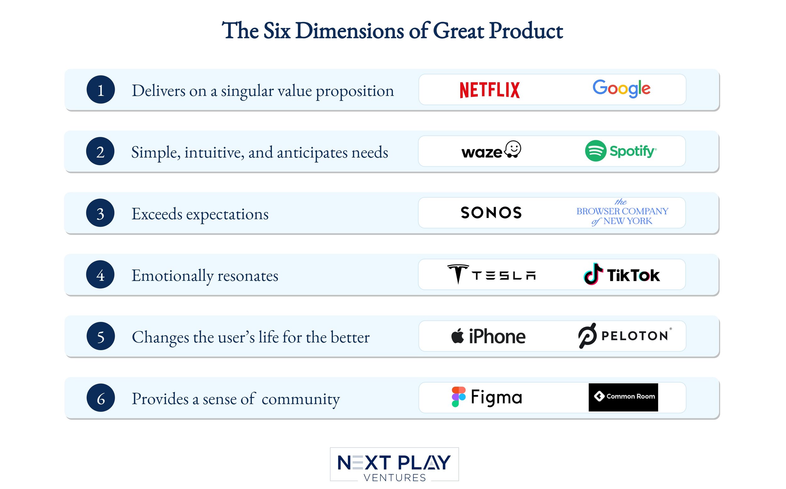
The Six Dimensions of Great Product
How do you define the qualities that comprise a great product? In 2015, we introduced the five dimensions of a great product. Now we are reintroducing that framework with a new addition centered around a dynamic that became increasingly essential over the last year: a sense of community. We hope this framework helps founders and product leaders understand the core underlying aspects of what it takes to build truly great products for their users and customers.
1. Delivers on a singular value proposition in a world-class way
Above all else, great products have a clearly defined sense of purpose, deliver value in a singularly focused way, and do so as well or better than any other product in the marketplace. Google presents a canonical example.
When first introduced in 1998, many questioned why Google would even bother with search. Alta Vista had already come to define the genre and for the most part, people thought the search problem was essentially solved. However, through its singular focus (a search box offered on an otherwise blank page), a game-changing approach towards search relevancy called Page Rank, and an audacious goal to index the entire web, Google not only surpassed Alta Vista as the clear category leader, it went on to fundamentally change the way society organized and accessed the world's information. It would eventually become one of the most valuable companies in the world.
Google started with a singular value prop, but has also extended far beyond search, into maps, email, video, cloud, mobile, and more. One example of a company that has maintained its focus over time is Netflix. Netflix’s singular value proposition is to provide entertainment for its users. While the distribution channels (mobile, OEM partnerships, pre-installs) and medium (DVDs, streaming) have evolved over the years, its core value proposition has remained constant. That consistency has paid off for the business and its ability to maintain a leadership position in media, despite the significantly intensifying competitive landscape.
2. Simple, intuitive, and anticipates needs
Waze is a mapping app that combines the best of driving directions and the collective intelligence of drivers to provide real-time updates regarding the most efficient way to get from point A to point B. It's extremely simple and intuitive to use: Just type in your destination, pick a route, and you're off. As good as that experience has always been for me (can't count the number of times it's shaved 10-15 minutes off of what would otherwise have been an hour-long trip), it was a simple, anticipatory feature that took my appreciation of the product to another level.
Leaving the office one night before beginning my regular commute home, I opened up the app to see what traffic looked like. Repeating an almost daily use case, I was about to select my destination, when a question popped up: "Are you on your way home?" I immediately thought to myself "Yes, I am on my way home, and that's pretty cool." This wasn't rocket science: The app was relying on the consistency of previous inputs during that particular time of day to make an educated guess on where I was going. In doing so, Waze not only saved me a few keystrokes, it demonstrated an understanding of my needs and made an indelible impression as a quality product that's lasted to this day.
Spotify is another example of an app that is simple, intuitive, and anticipates needs. While listening to an album or playlist, Spotify’s “Autoplay” feature anticipates the music coming to an end, and automatically plays similar songs to avoid interruptions. Further, Spotify’s “Daily Mix” playlists consistently offer a simple and intuitive way to discover new music that is similar to your tastes. The quality of those recommendations and the way it adds to the overall listening experience on Spotify, makes it the first and only app I now use for music, despite having subscribed to myriad other services previously.
3. Exceeds expectations
I've long been a huge fan of Sonos. The product is extremely easy to use and delivers on its singular value proposition in a major way: Enabling customers to listen to music on demand from any room in the house. After installing several units many years ago, it re-introduced me to my love of music and dramatically increased my overall music consumption. However, that's not why it's been included as an example of exceeding expectations. The reason I'm writing about Sonos is the company's customer service.
Well over a year ago, my wife and I were hosting a holiday dinner. As always, she had everything under control, but did have one request of me: To handle the music. "Easy," I thought. "I've got Sonos." As I sat down to select a playlist, that triumphant self-confidence quickly gave way to dread as it turned out our Sonos was down. Things got worse when I saw that as a result of the holiday, the customer service department would only be open for another 15 minutes. With most companies, this would not have ended well. However, Sonos is not most companies. The rep who answered the phone went way above and beyond the call of duty, staying on with me for nearly an hour while we ran a series of diagnostic tests. It turned out the service was unavailable as a result of our recent home Wi-Fi reconfiguration. We eventually got it working, the dinner went off without a hitch, and in addition to blowing my expectations away, Sonos had acquired a loyal customer and someone who recommends the service every chance he gets.
More recently, a new product experience exceeded my expectations. I was recently onboarded onto The Browser Company’s new web browser, Arc. Having used more traditional browser interfaces for well over two decades, trying Arc for the first time felt like a game-changer. From the onboarding itself (accomplished 1:1 with an employee of the company) to the new paradigms introduced by Arc (e.g., lists, note-taking, and minimal UI that focuses on the content), my expectations were absolutely surpassed and I knew Arc would be my new default browser. For many apps, that initial user experience is a crucial opportunity to exceed expectations and provide moments of delight.
4. Emotionally resonates
Shortly after taking on the new product role, one of the first things I did at the weekly staff meeting with product executives was have them write down a favorite product and a description of how it made them feel. Once completed, each person was asked to stand up to explain their answer. The point of the exercise was for everyone on the team to see how much enthusiasm and passion people conveyed when talking about a great product experience.
When it came time for one of the more laconic execs on the team to stand up, he excitedly began talking about his Tesla Model S, and remarked it was like "driving the future." I replied, "You've got to be kidding me," and held up the piece of paper I had written my response on. It said, "Tesla Model S: Driving the future." We had both cited the same product and described the exact same feeling, despite having never talked to one another about it, and Tesla never explicitly marketing itself that way. Turns out, the company doesn't need to. That's simply the way customers feel when driving a Tesla.
More recently, like hundreds of millions of others, I’ve started using TikTok. It’s no surprise that TikTok has become one of the largest, fastest-growing media platforms in the world. When watching TikTok videos, there’s not one single feeling I experience, but rather a full range of emotions - from joy and inspiration, to pathos and compassion, to curiosity and intrigue. TikTok has been world-class at enabling creators to tell their stories in a simple, short format, and recommending the right video at the right time to its users, facilitating an emotional experience each time someone opens the app.
5. Changes the user's life for the better
In ways large and small, great products change their customers' lives for the better. Every product mentioned here does that. Yet, perhaps the clearest manifestation of this dynamic for me is the one product that enables all of the other product experiences I've written about thus far: The Apple iPhone. The iPhone makes things more convenient and productive in countless ways. It provides services that inform, entertain, educate, and inspire. To a large extent, it's become more than a product: It's an extension of who I am. It's essentially become the control panel for my life.
More recently, Peloton became another product that changed my life for the better. I was relatively late to the Peloton craze, but after hearing about it from a number of colleagues who swore by it, I decided to give it a try. I quickly became a huge fan as they absolutely nailed the value proposition of helping people become more fit. For the last couple of years, I have been a weekly active rider, which has undoubtedly improved my health and fitness.
6. Provides a sense of community
Finally, great products create a sense of community for users and customers. While feeling seen, heard, supported and connected has always been a fundamental part of the human condition, this dynamic was meaningfully amplified by virtue of the pandemic and the increasing isolation people experienced as a result. More than ever, people are seeking connection, collaboration, and a safe, trusted place to communicate. Great products help foster these environments for their stakeholders, enabling a dynamic ecosystem to flourish.
One of the companies leading the way here is Figma, a collaborative design interface tool. Figma cultivates community in at least three important ways: First, their product is natively designed for a multi-player use case -- brainstorming and designing as a team. Second, the aptly-named Figma Community enables users around the world to explore, share, and comment on Figma files and plugins, creating a rich way for designers to build on each other’s work no matter where they are. Lastly, Figma hosts an annual event, Config, for its user base and broader community. Over 50,000 people joined the 2021 Config event where they saw the latest product launches, shared insights with each other, and learned best practices from fellow designers. Figma has embraced its community from day one, and almost a decade later, that investment has helped its users feel a sense of belonging when using the product.
Common Room is a relatively new startup squarely focused on helping companies create a sense of community for their customers. They realized the value of product users as advocates and contributors, and built a unified view for community managers to understand what’s happening across platforms (e.g., Discord, Twitter, Slack) and strategically engage with their most passionate and loyal fans. As more product-led companies turn to their users, expect them to cultivate communities to bring them together in a meaningful way.
Though we’ve shared singular product anecdotes for each dimension listed above, we could just as easily have used any of these products to exemplify all six dimensions, e.g. how Waze exceeded expectations the first time it predicted to the minute how long it would take to reach the destination despite multiple traffic jams, how Tesla's overnight software updates have redefined the ease and intuitiveness of the automobile dashboard, how Peloton has created a sense of community through its social rides, etc. What makes great products truly stand out from alternatives in the marketplace is that they don't just deliver on any one of these six dimensions, they deliver on all of them.
Note: We are investors in The Browser Company, Figma, and Common Room. 
